joshuanamenyi.com

When you can't find the right font, you modify your own

Frustrated after a long search for a font with all the glyphs I need, I decided to take things into my own hands and modify my own. This new font would need to be somewhat playful, as multifunctional as possible, and have Hungarian language support.

I started with Inter by Rasmus Andersson as a base for its functionality and open license, and got to work on a new set of glyphs and elements for my fork of the font per my own set of criteria. The new glyphs had to fit into the font without breaking it, while giving it a little friendly pop.

References, tone, and changes

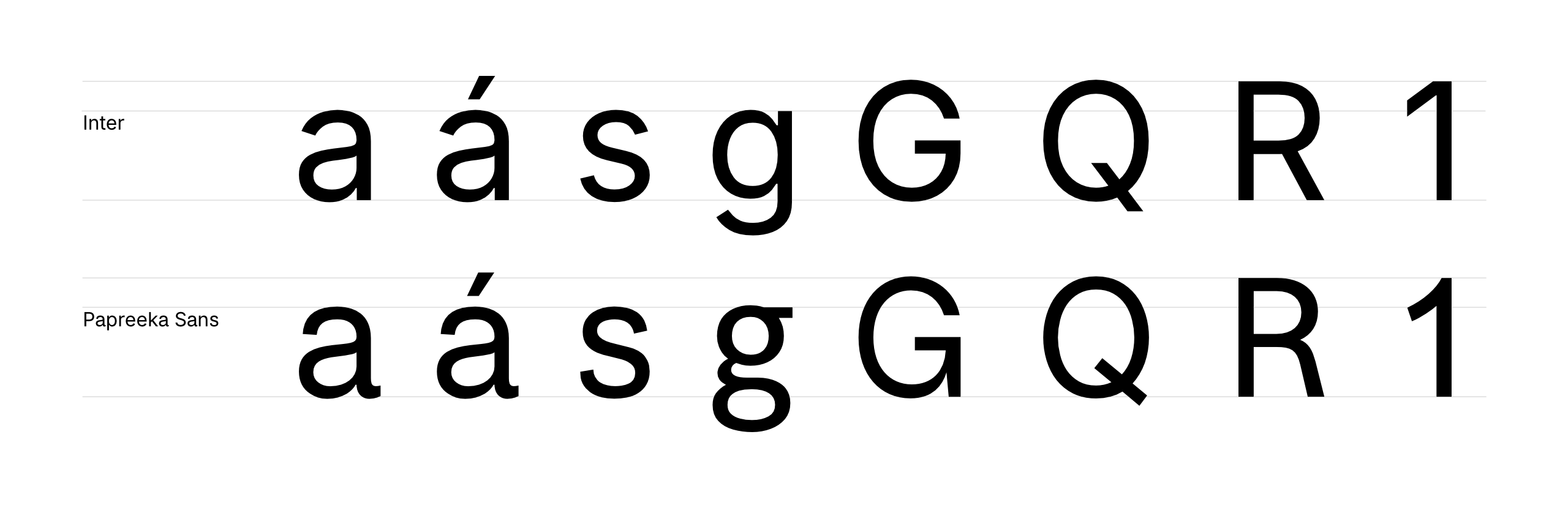
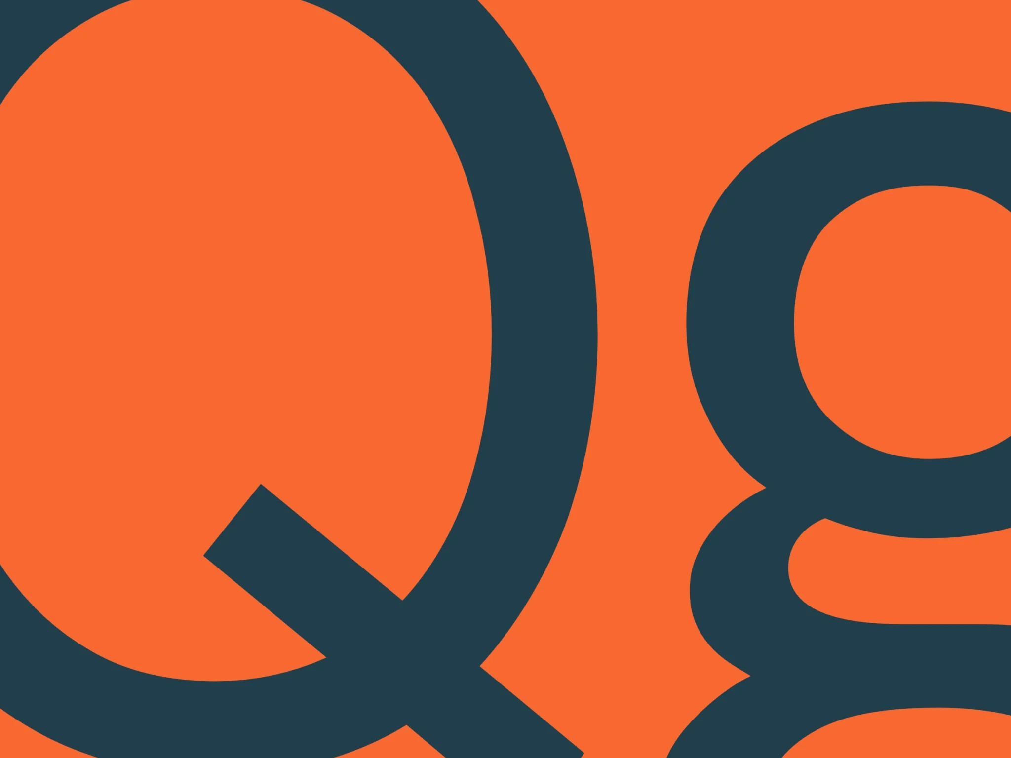
I greatly appreciate grotesk typefaces, their history, and their looks. The classic tail of Helvetica’s ‘a’, among others, is an element I wanted to bring into the new glyphs. I specifically chose to leave the rest of the Inter typeface alone with all its utility, and only make changes to a, s, g, Q, R, G, and the number 1.

For a more playful feel, I drew a new, double-storey lowercase g glyph, added a tail to the a, tapered off the ends of the s, and replaced the number 1 with a custom glyph.

I modified the letters R and Q with more classical elements, and replaced the primary G with the secondary glyph from Inter, while making a few modifications to the sizing.
Aa


Aa Áá Bb Cc Dd Ee Éé Ff Gg Hh Ii Íí Jj Kk Ll Mm Nn Oo Óó Öö Őő Pp Qq Rr Ss Tt Uu Úú Üü Űű Vv Ww Xx Yy Zz
0123456789!?

Aa


Aa Áá Bb Cc Dd Ee Éé Ff Gg Hh Ii Íí Jj Kk Ll Mm Nn Oo Óó Öö Őő Pp Qq Rr Ss Tt Uu Úú Üü Űű Vv Ww Xx Yy Zz
0123456789!?

Aa


Aa Áá Bb Cc Dd Ee Éé Ff Gg Hh Ii Íí Jj Kk Ll Mm Nn Oo Óó Öö Őő Pp Qq Rr Ss Tt Uu Úú Üü Űű Vv Ww Xx Yy Zz
0123456789!?

Complications and breakthroughs

Bringing in a double stacked g turned out to be a bigger challenge than I originally anticipated. Reviewing other fonts and forms for reference, optically aligning and adjusting brackets to fit seamlessly with a font not designed for it, and then doing it again for both normal and italicized styles of three weights was an endeavor.
Re-hinting the font to let it appear with other letters properly opened a rabbit hole of research I was happy to dive into.

The ideation and research phases were lots of fun, however, and I enjoyed every moment of it, despite the many frustrations.

Final files and information

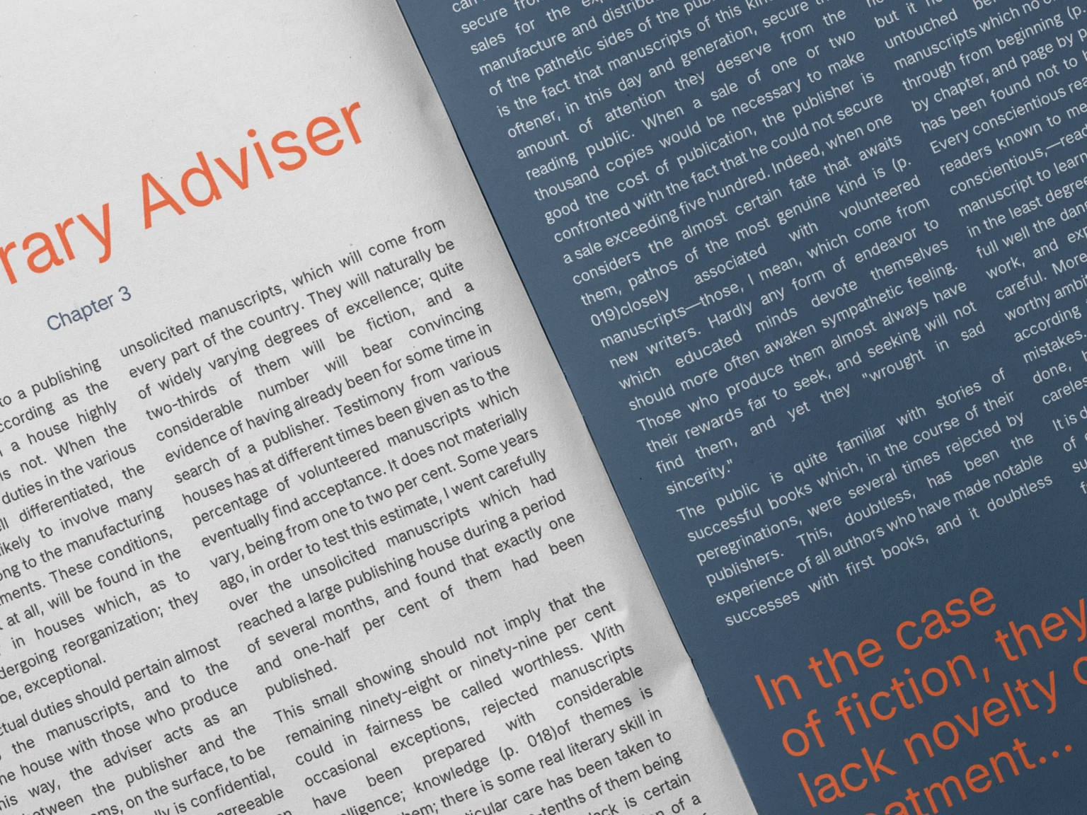
I started this project with the aim of creating a font that is playful, open, yet modern and utilitarian, that can be used in as many applications as possible. I chose from the get-go to rework 3 weights, Light, Regular, and Bold, with an italicized version of each, to get as much use as I could.

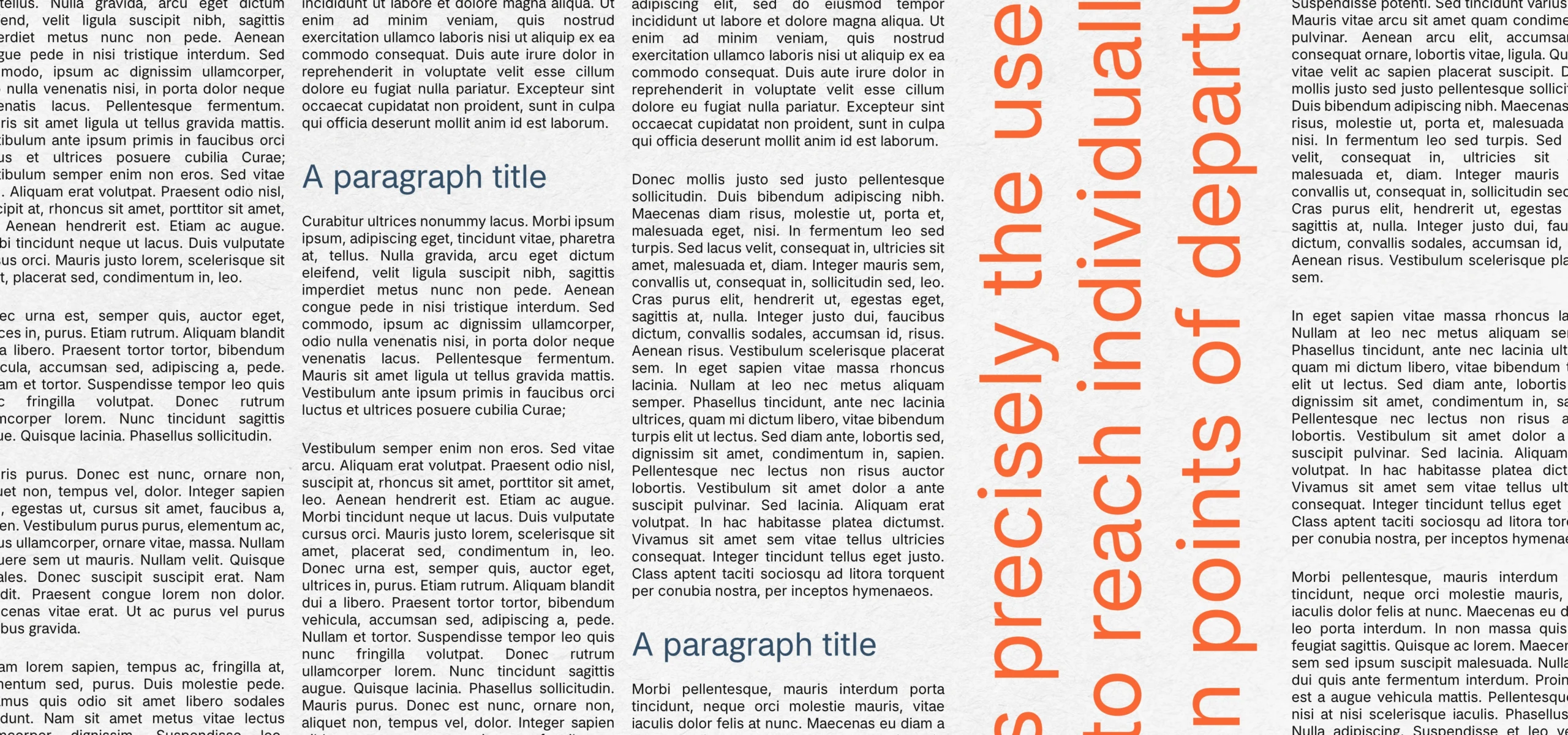
Inter is designed primarily for screens, but I found that adding these small changes actually allowed for better compatibility with printed media as well, as text flows more naturally from letter to letter.

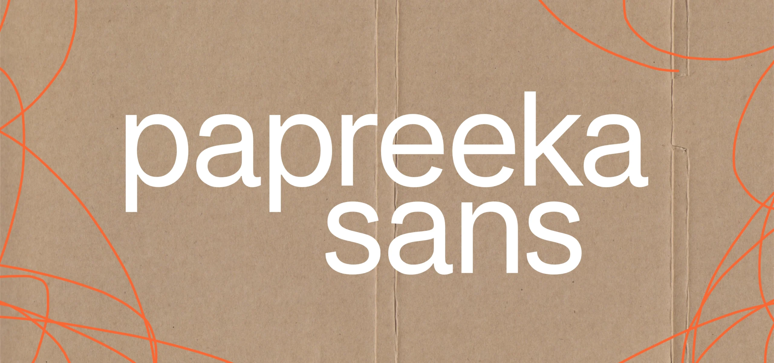
Papreeka Sans got its name from my favorite spice, Hungarian Paprika, which is in most of our traditional dishes, and is an amazingly versatile little seasoning.

Notice: Papreeka Sans is a modified fork of Inter, originally created by Rasmus Andersson. Inter is released under the SIL Open Font License 1.1.