joshuanamenyi.com

Complete branding for a distinct, analogue wine fest

Evignon began as an exploration of how traditional winemaking culture could be translated into a contemporary festival identity.

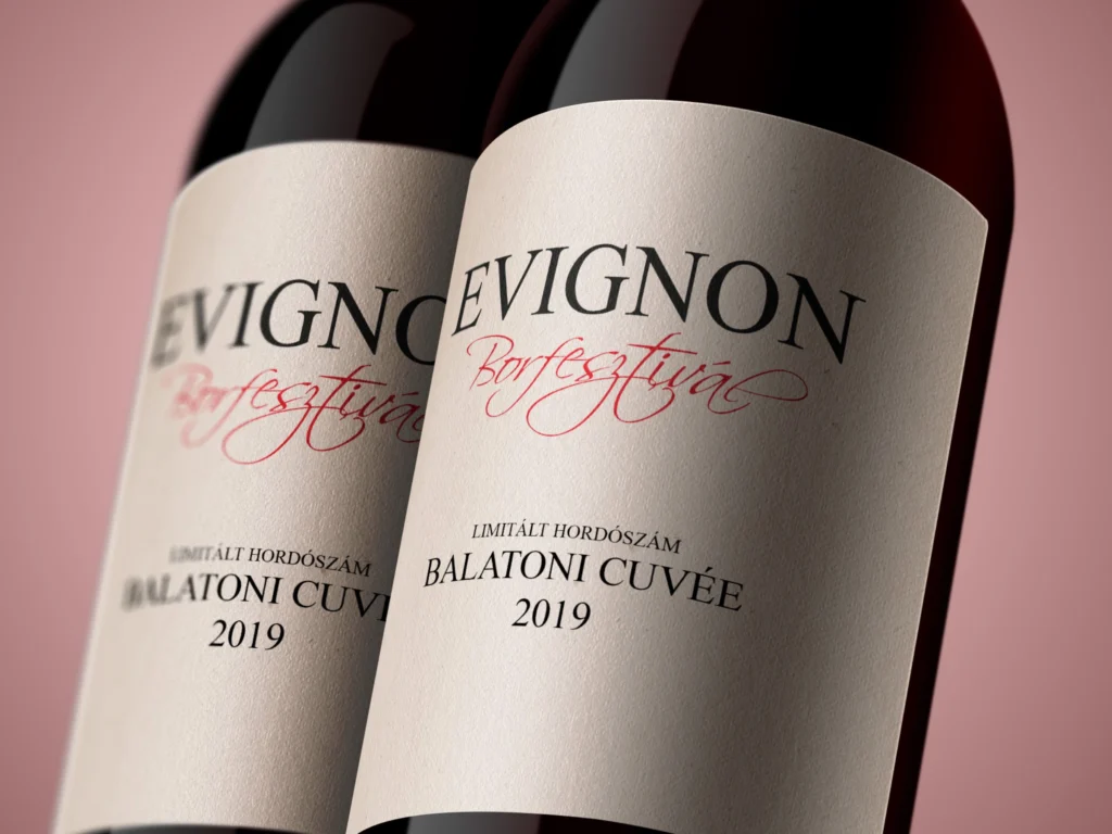
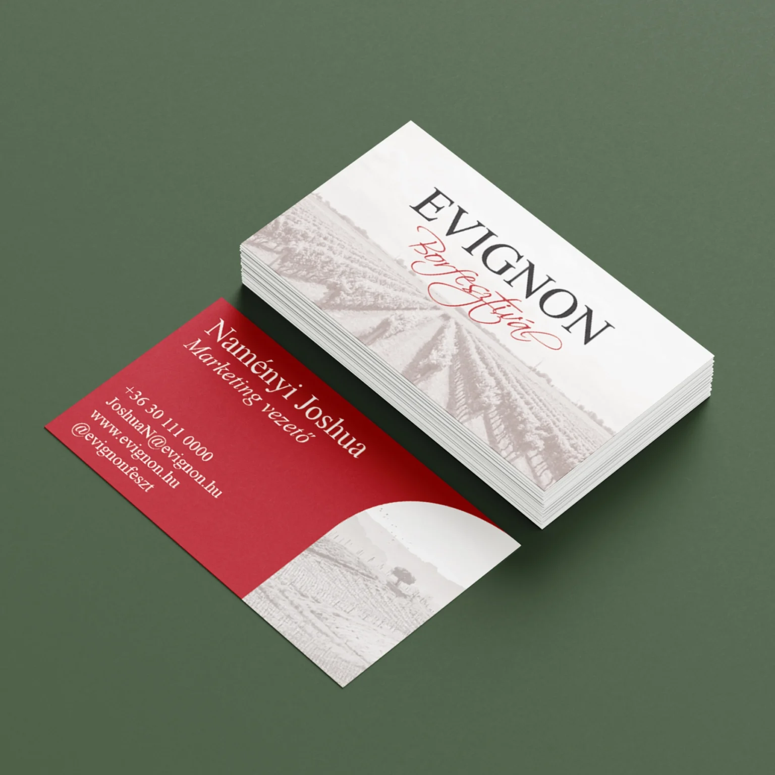
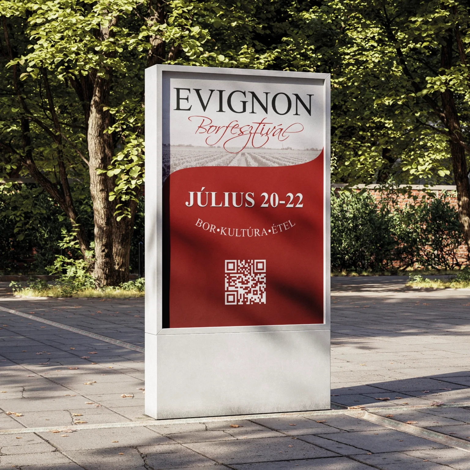
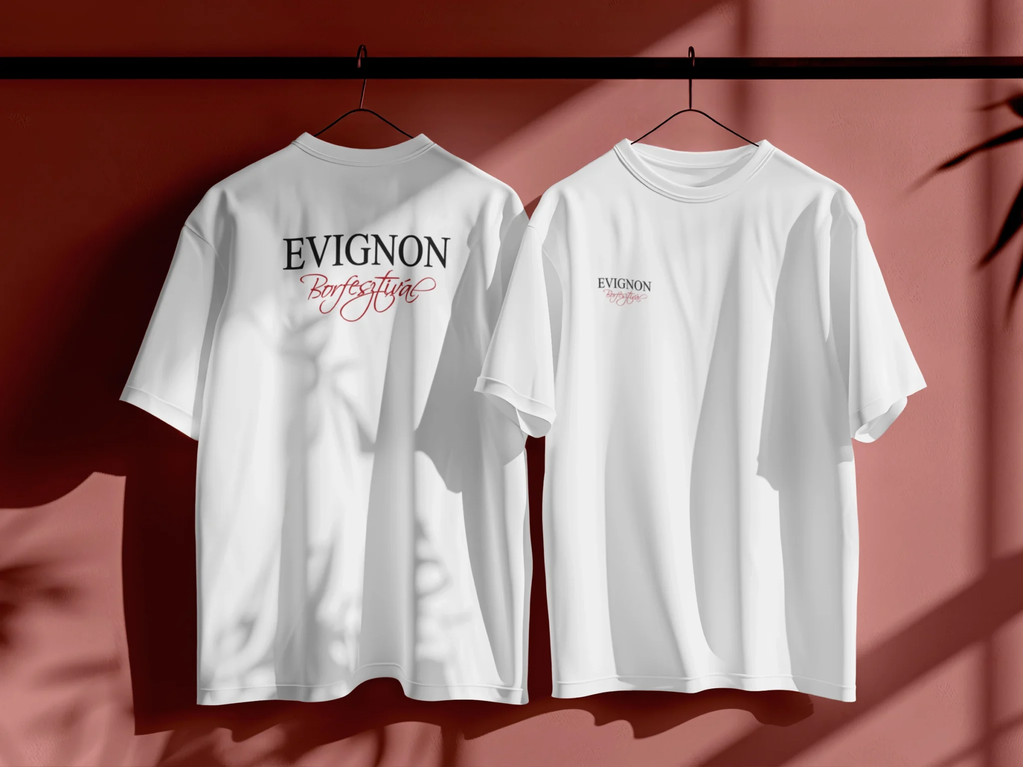
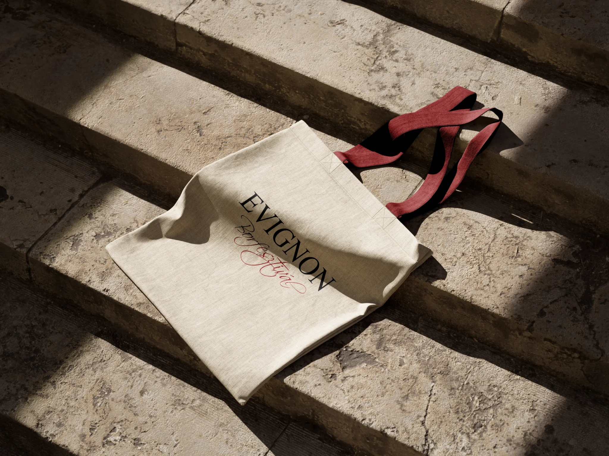
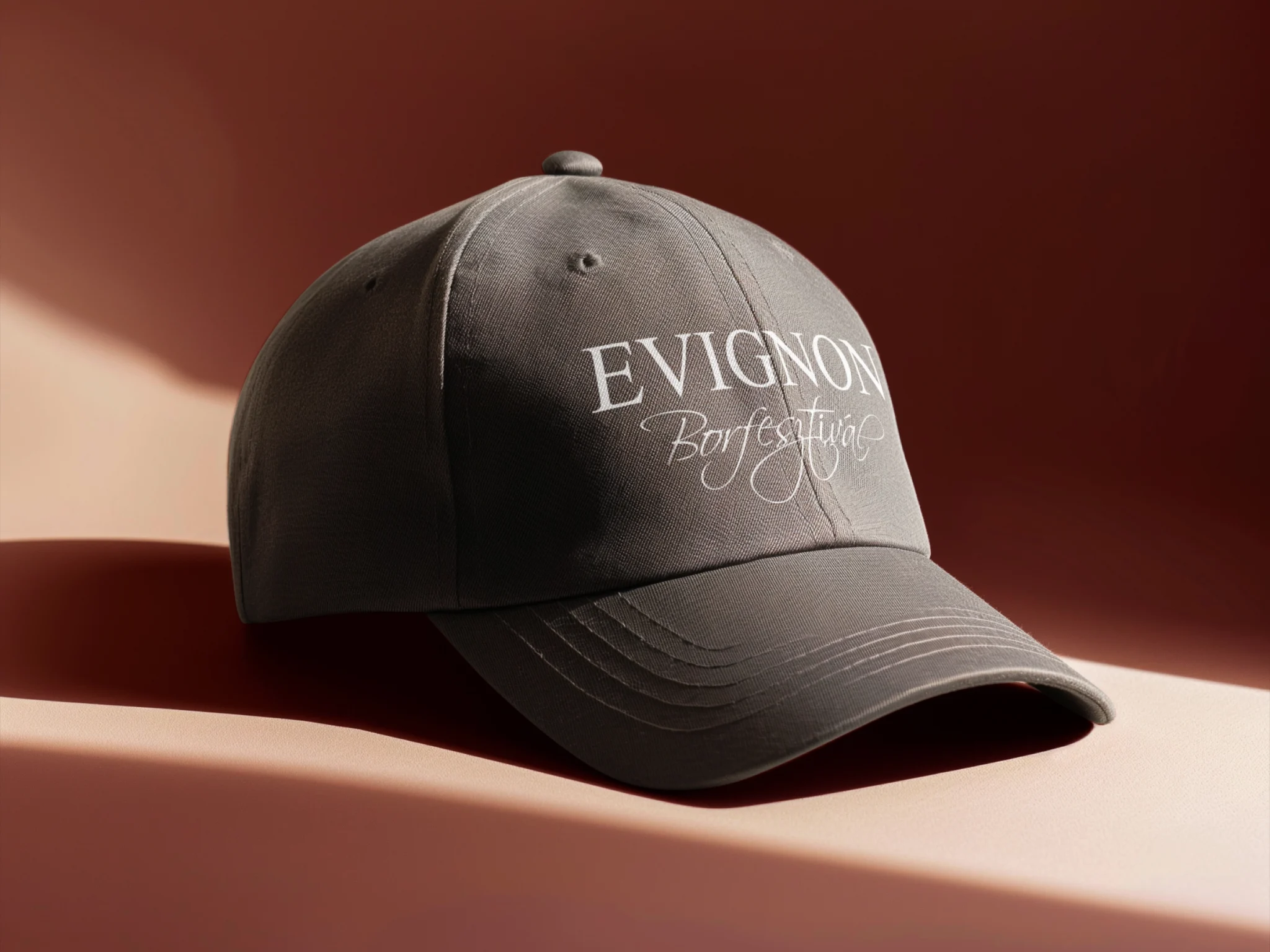
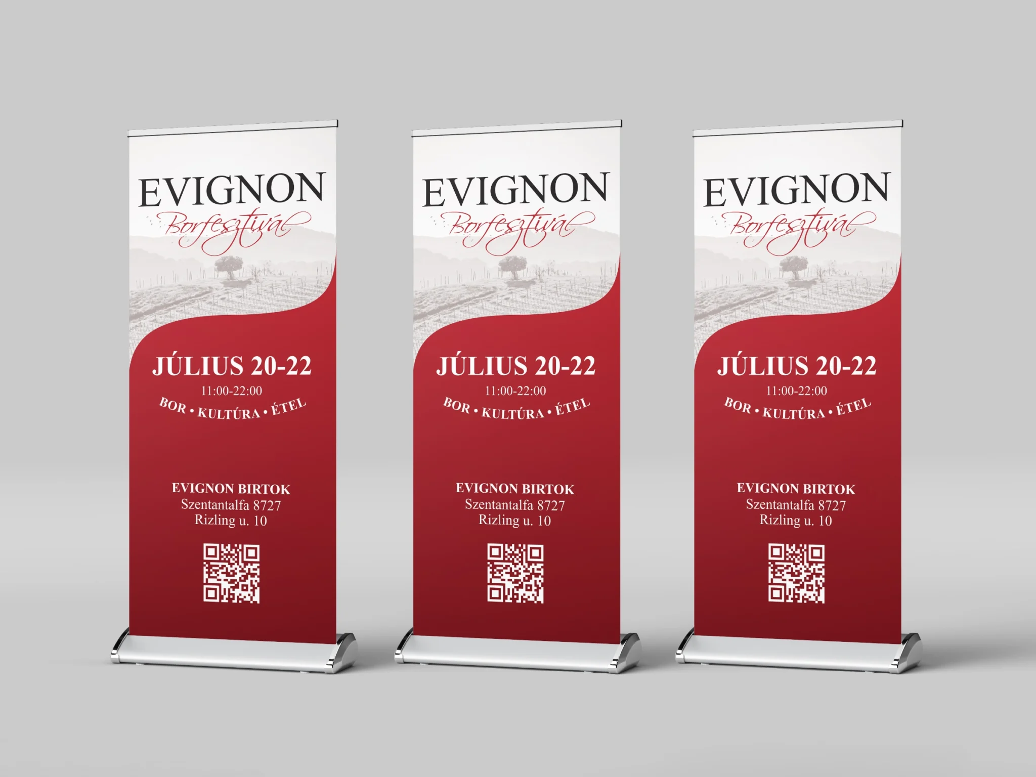
Set in Hungary’s Balaton wine region, the fictional festival provided an opportunity to develop a complete visual system, combining classical typography with expressive lettering and a palette inspired by wine itself. The goal was to create something elegant yet approachable, with an identity that could adapt to everything from wine labels and printed advertisements to signage and merchandise.

Logo Ideation & Voice

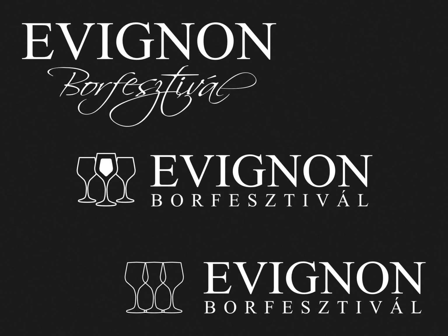
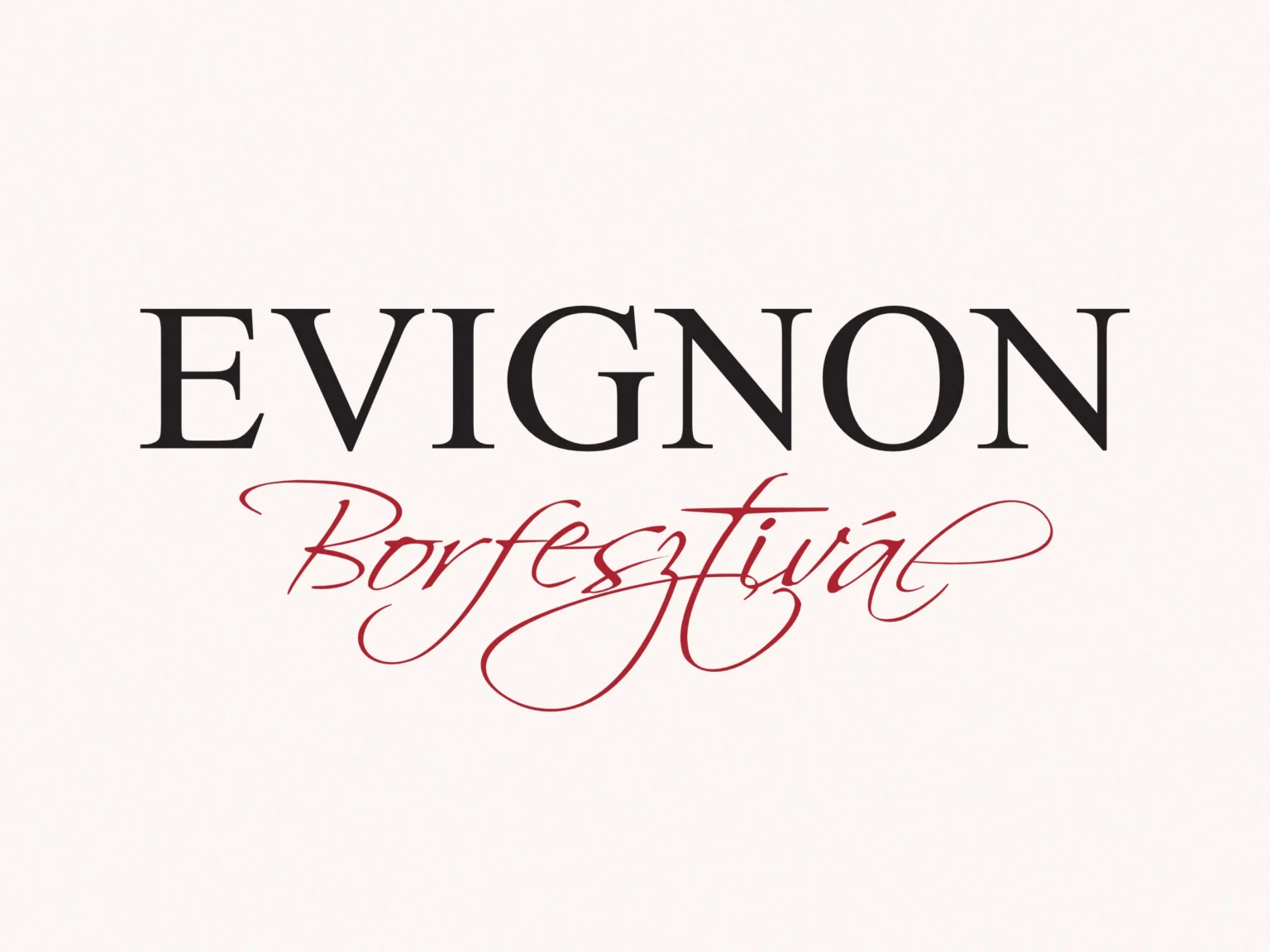
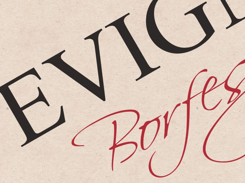
The logo went through various ideation phases, and the final version was chosen for its elegant yet playful impression. 

The handwritten font was modified to fit the desired proportions, and also to reference to vines and grapes. I also wanted the logo to look well on promotional, limited-edition wines that may be distributed during the festival event.

Distinct Type and Tone

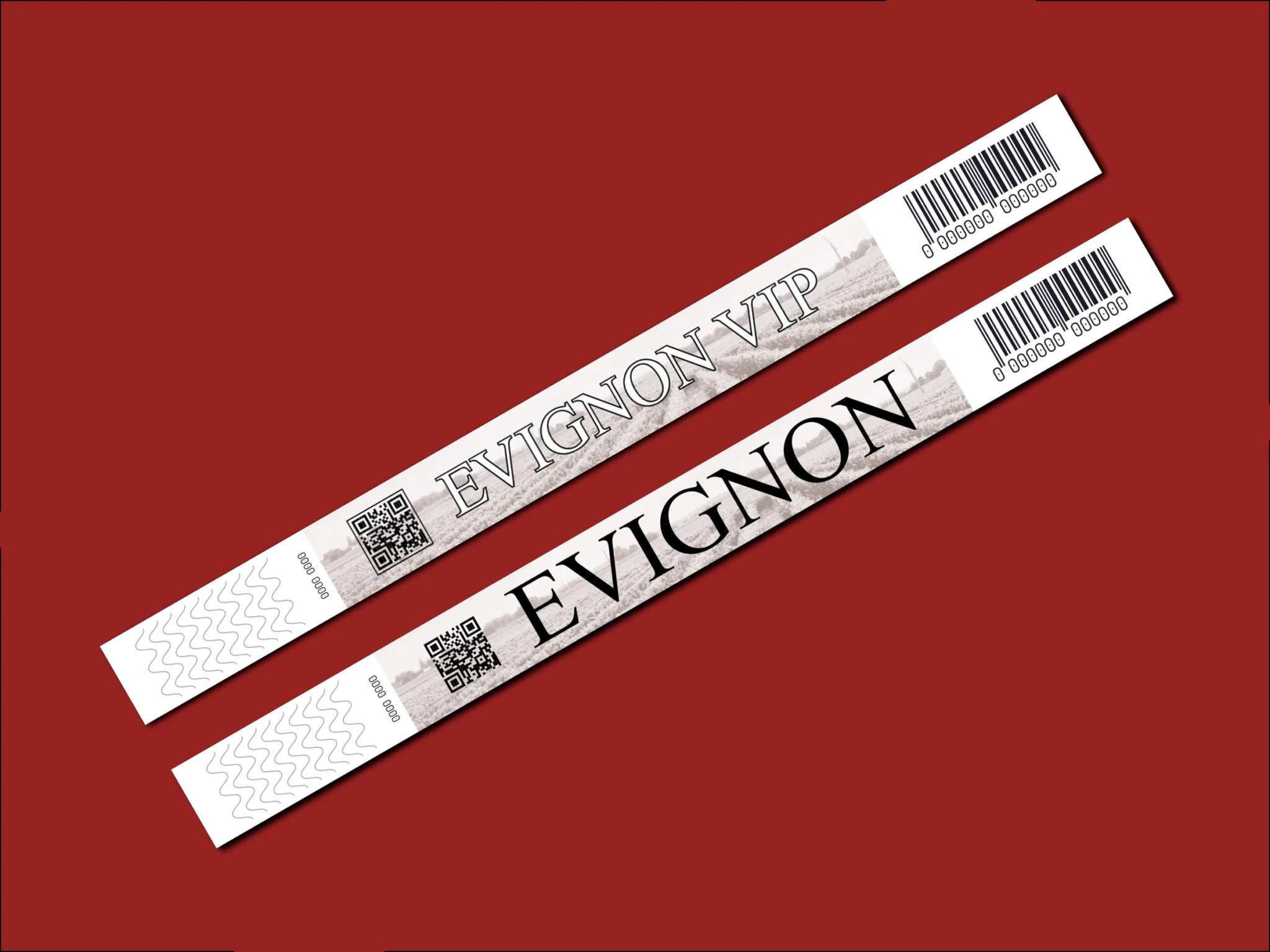
For a classic feel, I chose Times New Roman for headings, running text, and the logotype.

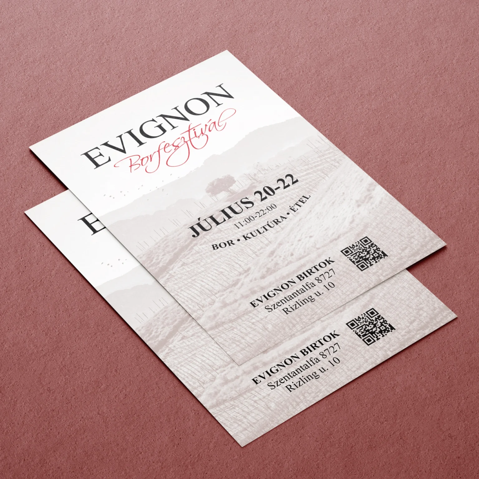
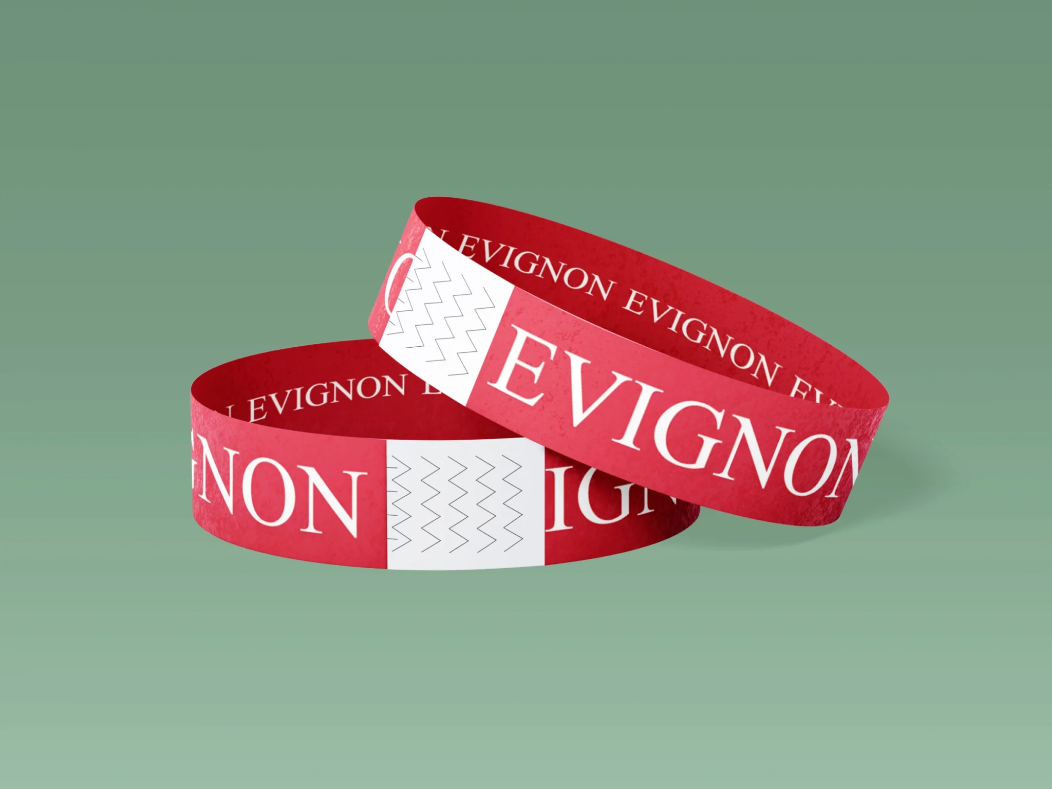
I chose colors and gradients that reference the many shades of red in a glass of wine, and ran that theme throughout the identity for added depth. The “white” areas on the marketing materials have a tinge of red as well, as if they have wine spilled on them, which is fairly common at any wine event.
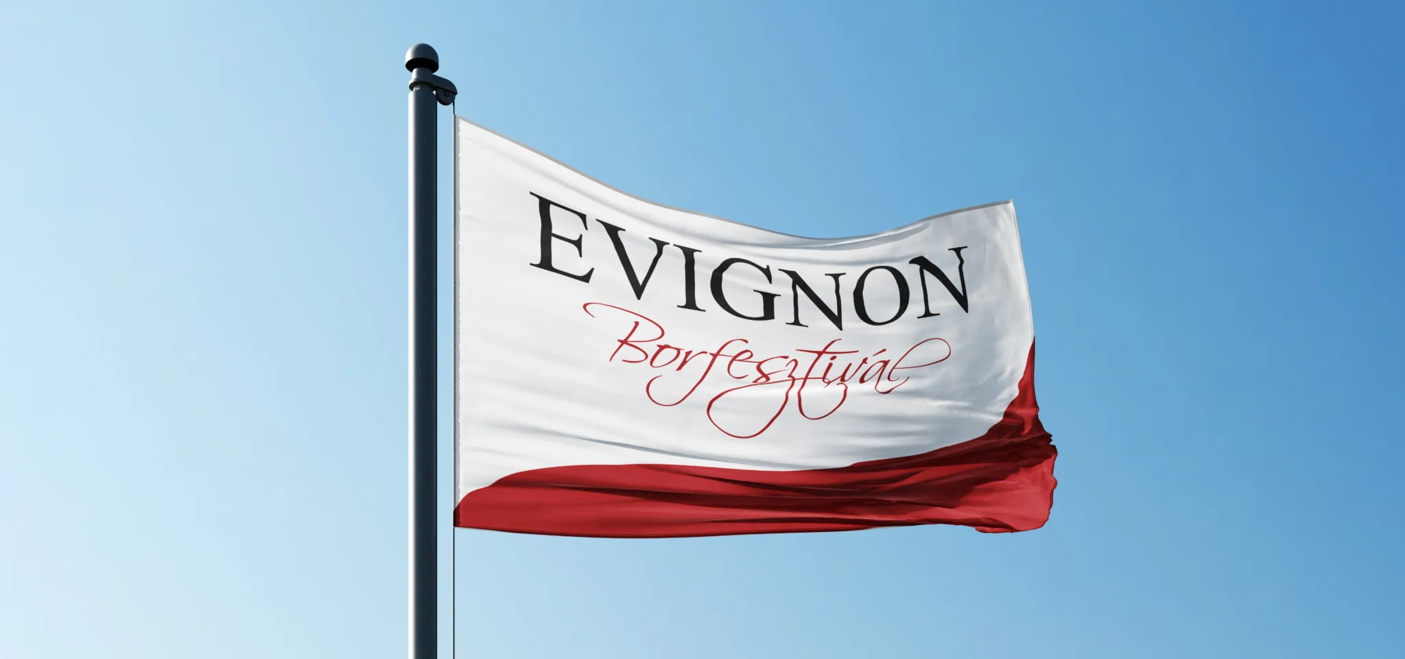
Finals and Results

We finalized the project with a set of marketing and social material, event merchandise, and a cohesive identity that can be used for any other assets, should the need arise.