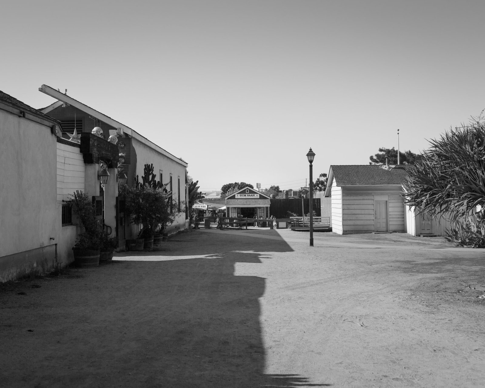
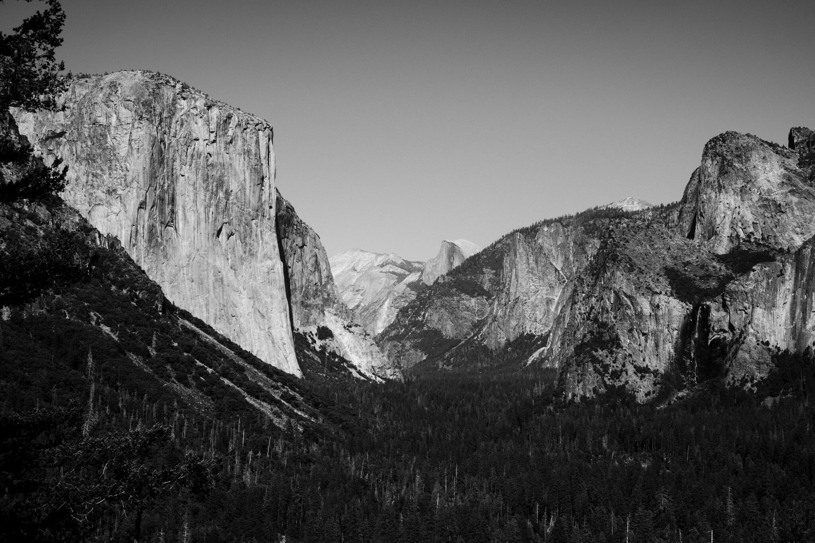
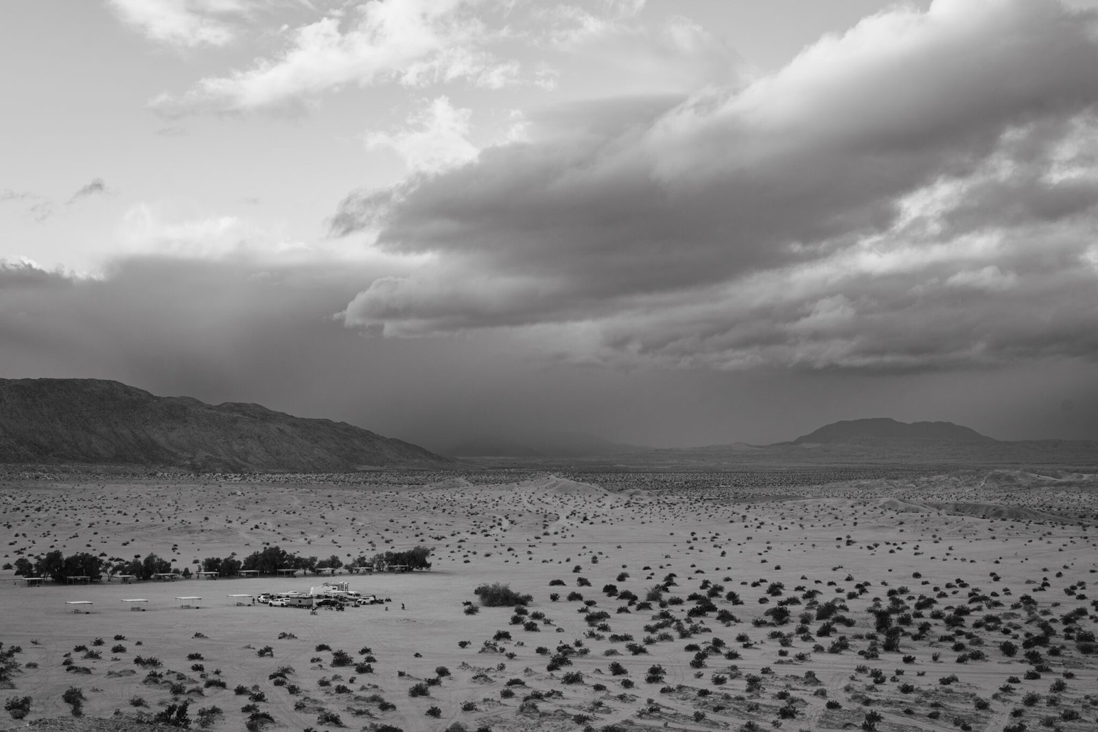
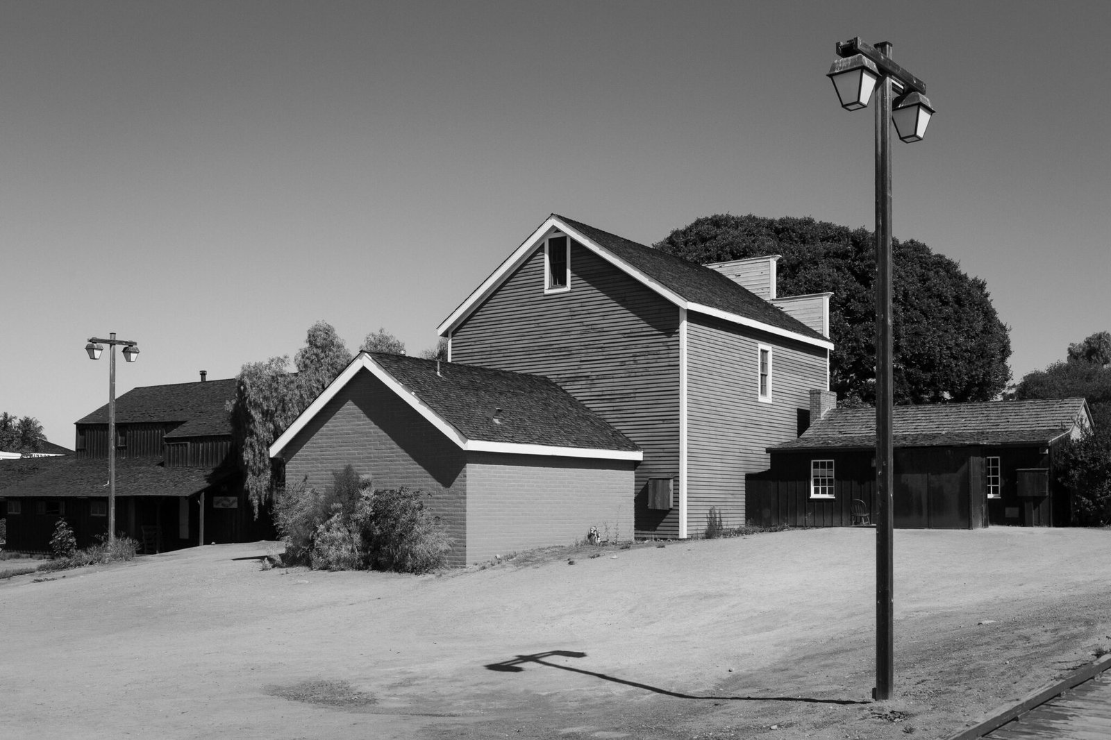
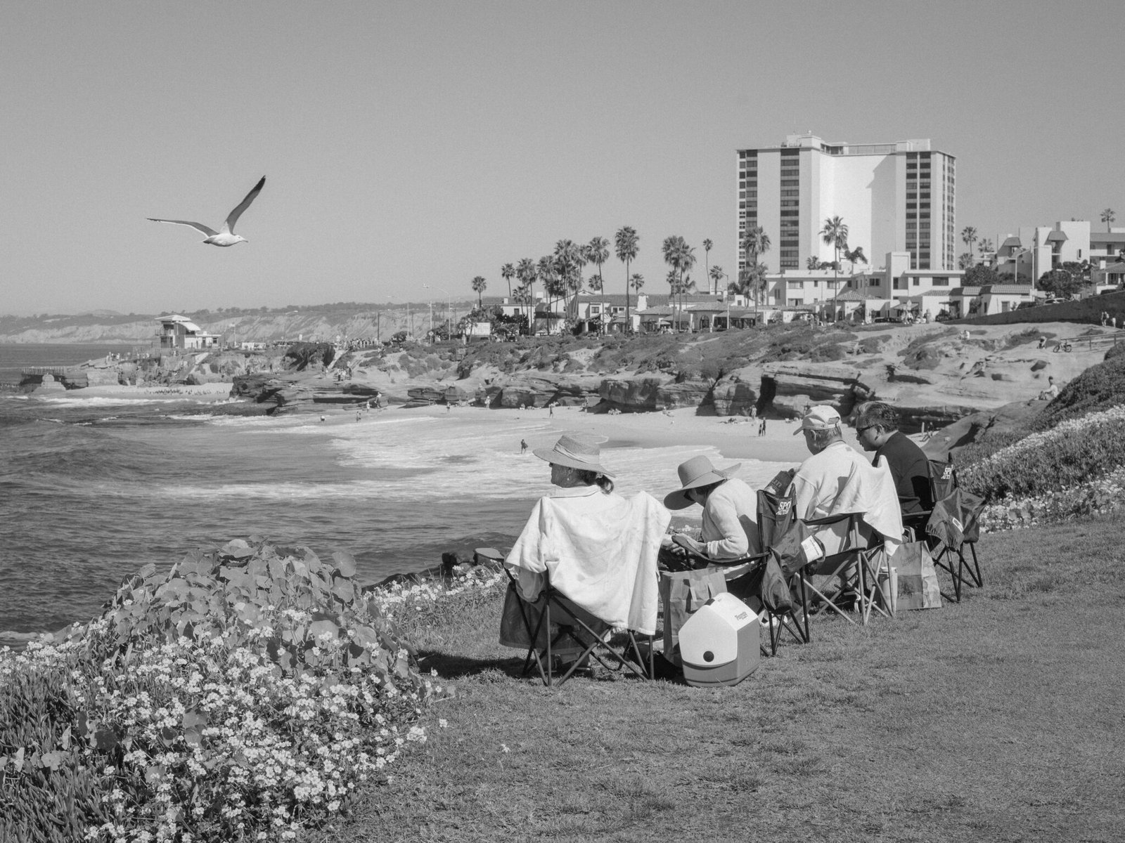
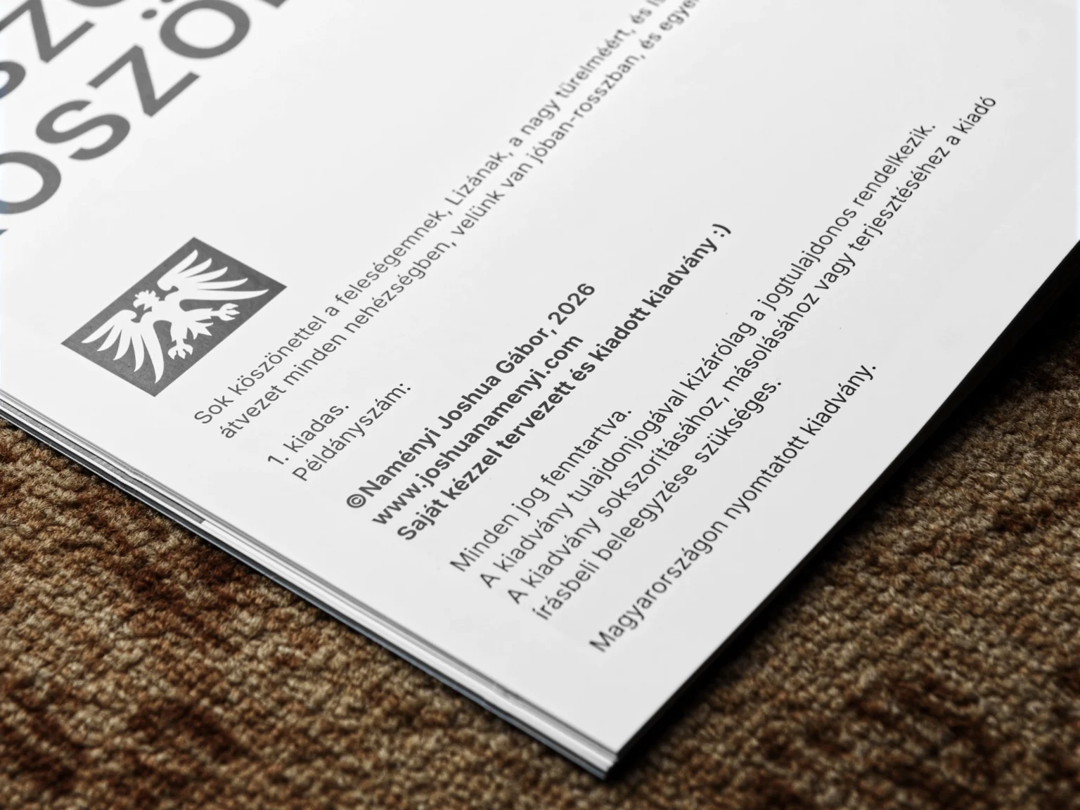
I completed a photo essay project documenting our life in San Diego in 2025, with the intention of compiling that work in a physical zine format.
To translate the varied images and themes in my photographic work onto printed material, I added my notes and thoughts as text, and chose to reflect the adventurous tone with a style reminiscent of classic documentary magazines.
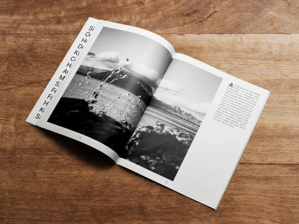
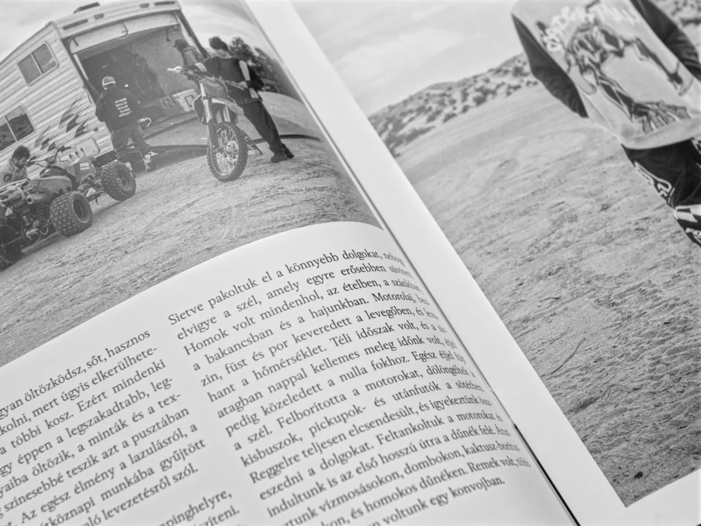
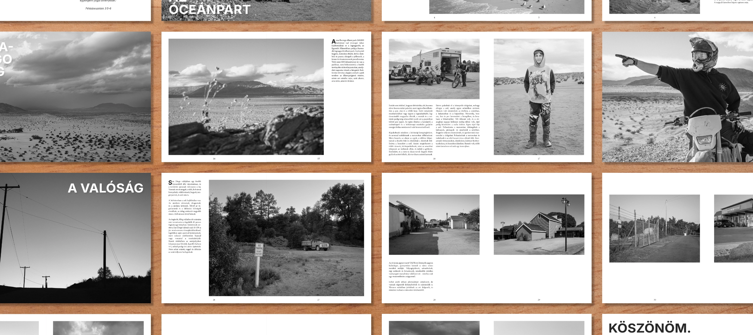
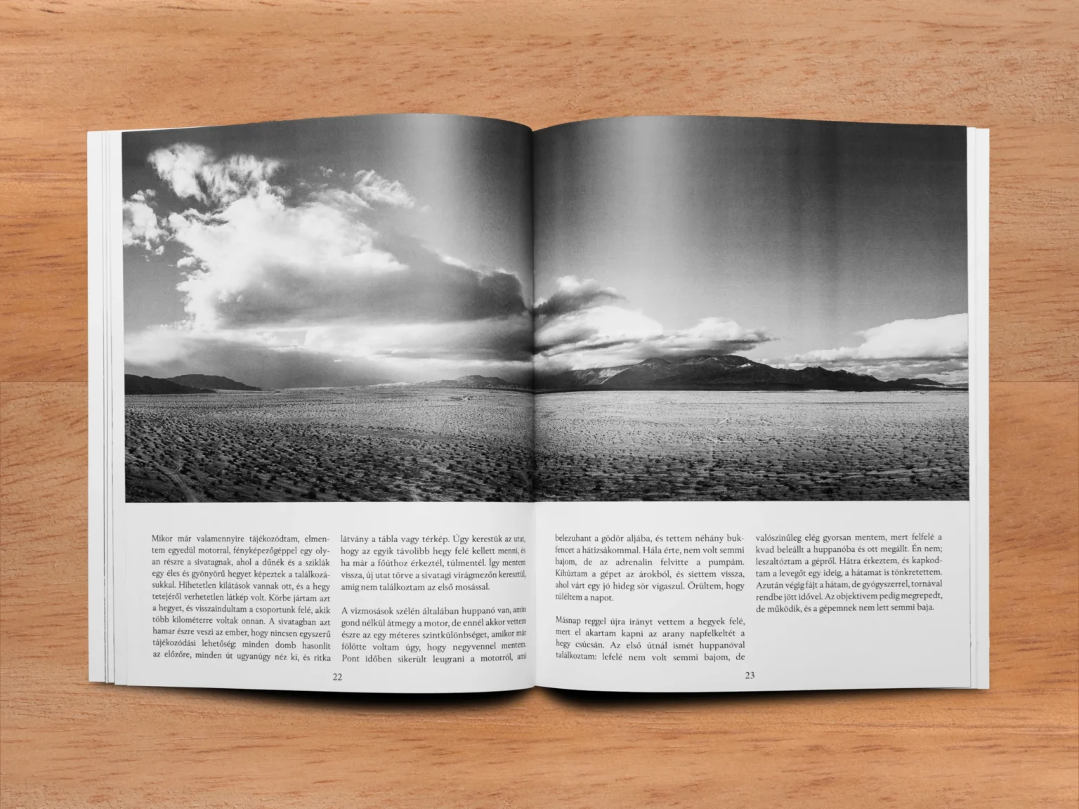
Inspired by classic documentary magazines, I developed a flexible editorial system using alternating single- and double-column text layouts. These arrangements allowed the relationship between photography and writing to change according to the narrative, creating a varied but consistent reading experience.
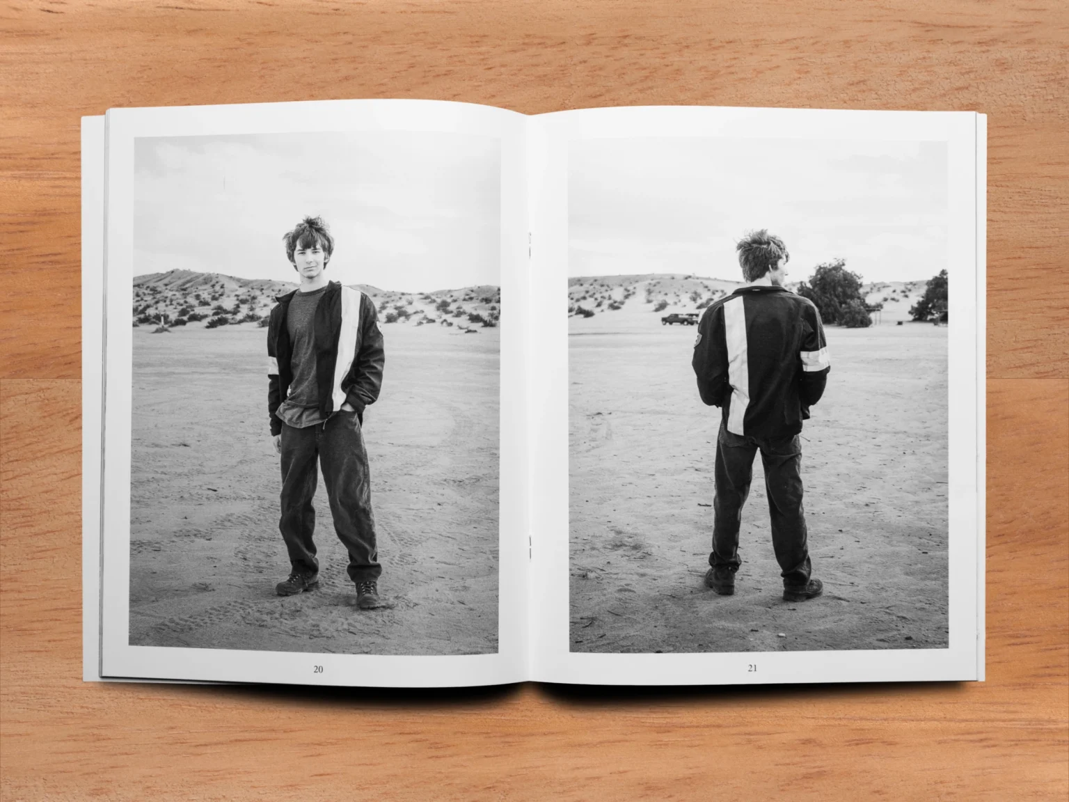
I prioritized giving the photographs sufficient space, allowing certain images to dominate entire spreads while others were accompanied by more extensive writing. From an initial selection of 131 photographs, I curated 29 images for the final publication.
I set the running text in a 12pt serif typeface, prioritizing readability over smaller alternatives. Much of the zine’s first edition was given to relatives, many of whom are older and would find smaller text difficult to read.
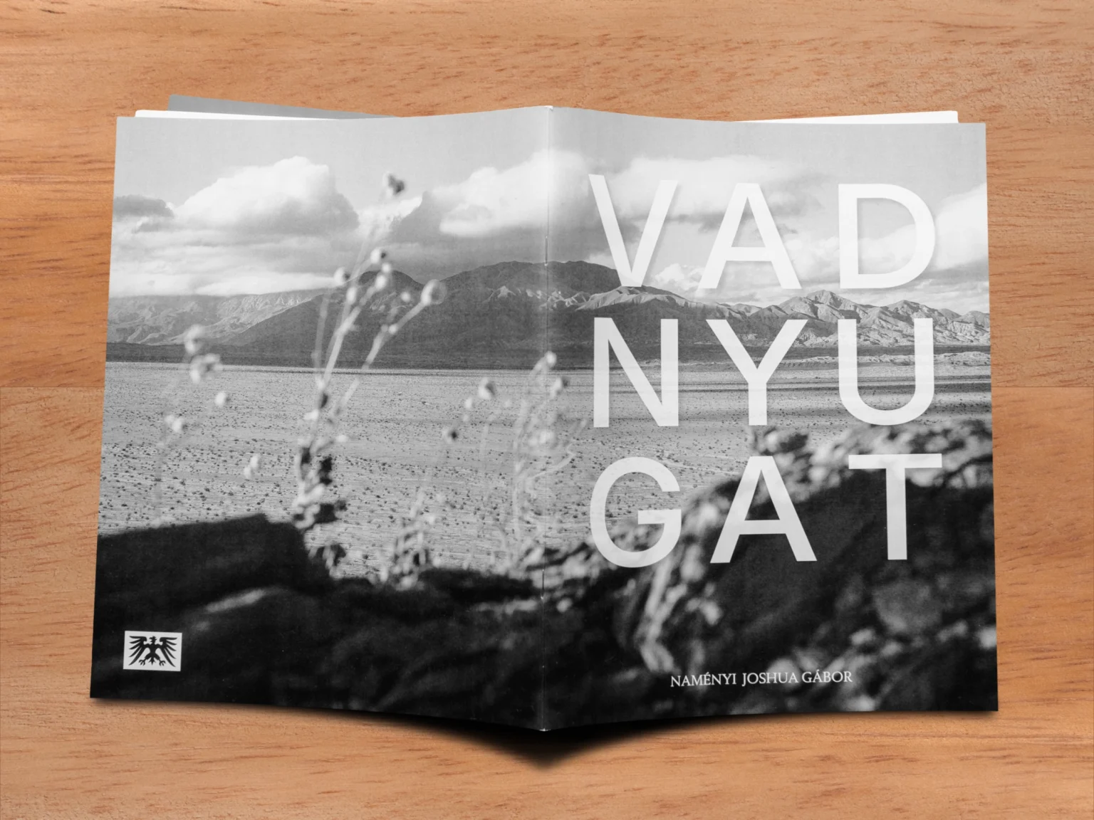
For contrast, I used the sans-serif typeface Inter for headings throughout the publication. The cover follows the same typographic approach, with slightly transparent lettering that allows the full-bleed, wraparound photograph to interact with the title.
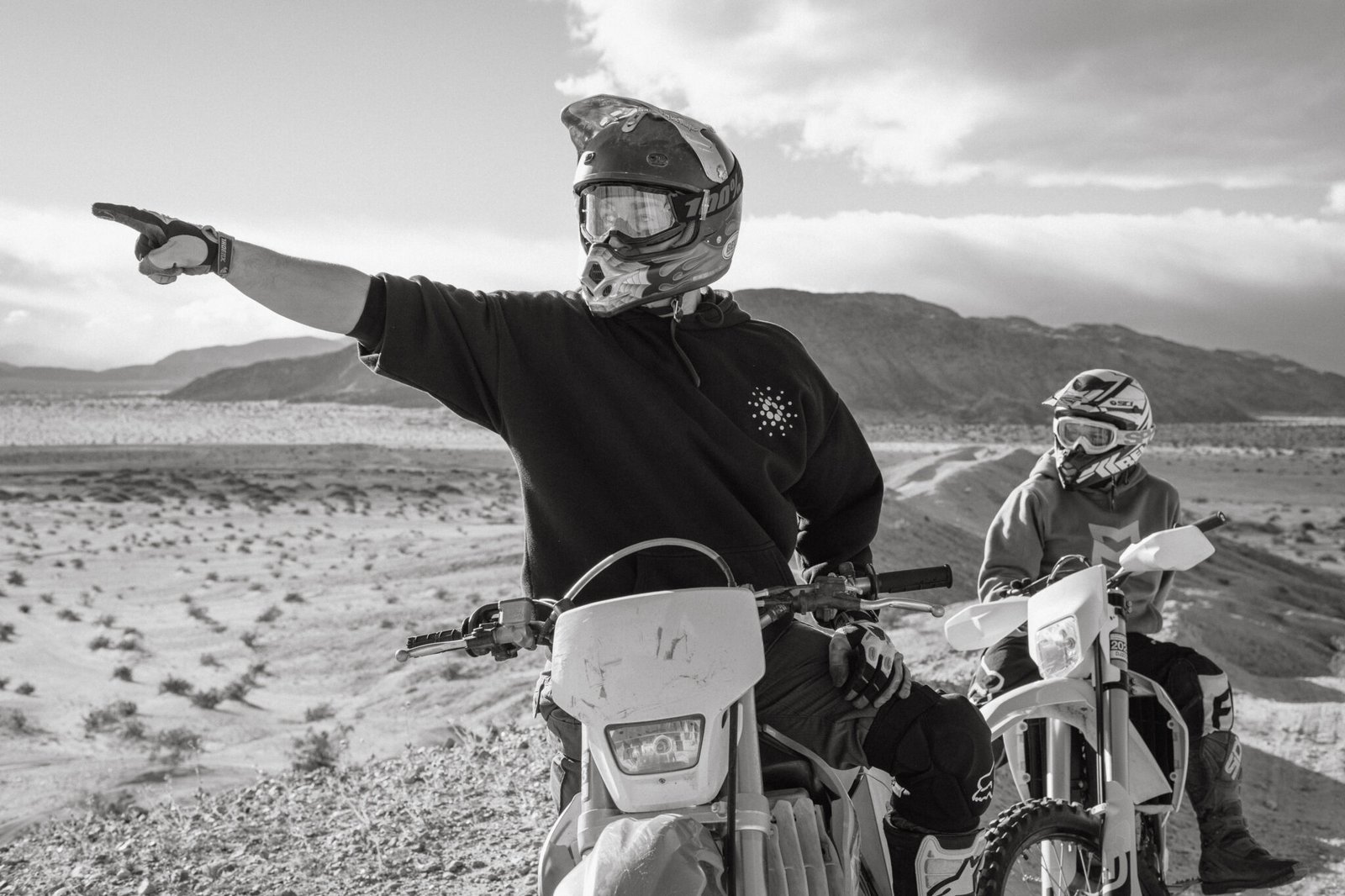
To establish a cohesive visual language, I edited all photographs in black and white. Beyond creating consistency, this treatment reinforces the nostalgic feeling of looking back through memories. I also found that many of the photographs carried greater emotional weight in black and white than in color.
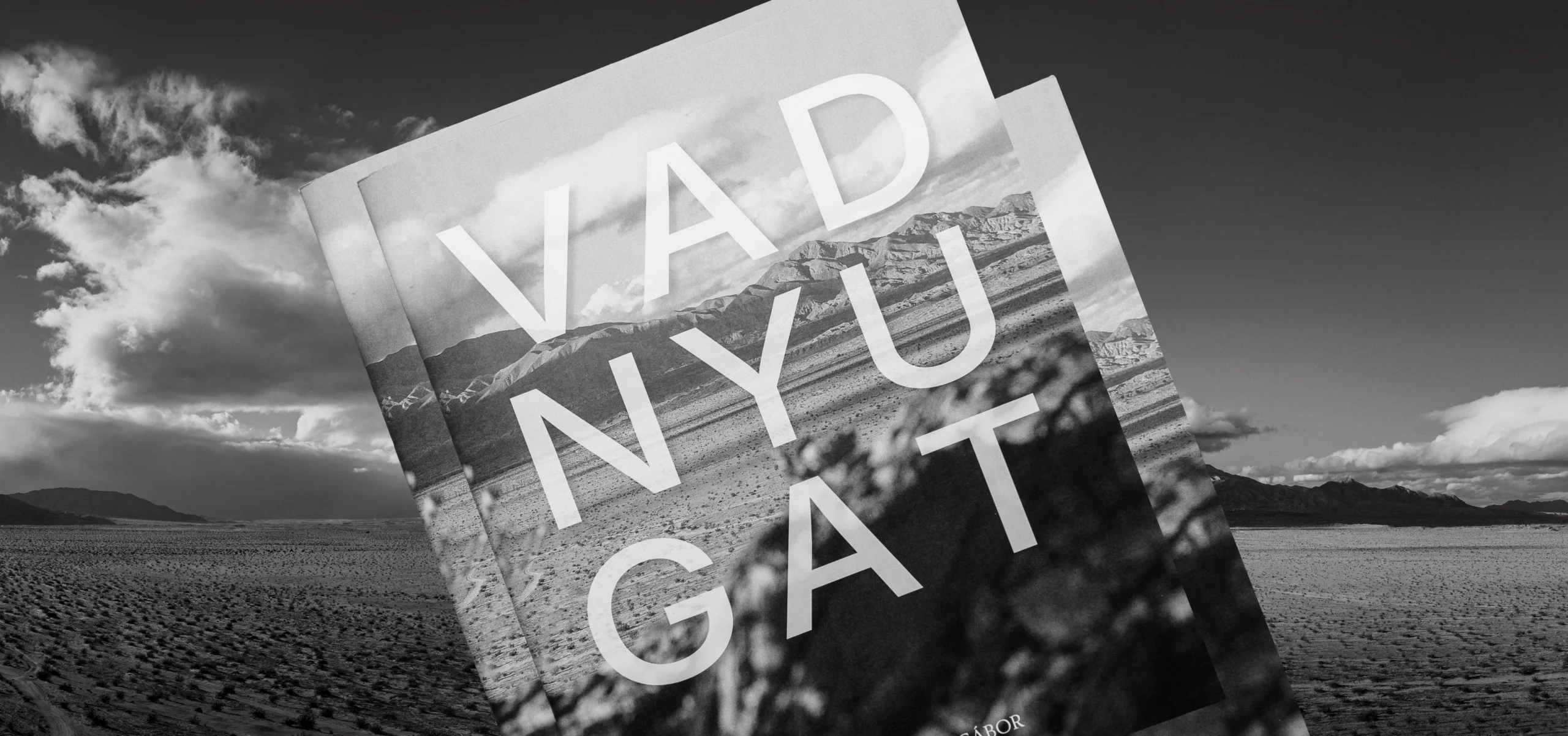
After contacting several print shops locally, it seemed that none of them could print at an acceptable cost for the small run of magazines I had in mind, so I turned to a large-scale printer in Budapest. Initially, I planned to print the zine on matte paper, but they sadly only had a few types of paper to choose from, so I had to adjust my editing for a semigloss 120gsm stock.
In the end, the semigloss paper actually lent itself to the images and text quite well, and I opted for a safety coating as well, to give the printed material a little longer to live. The zine was printed and staple saddle-stitched.
Once the zines were in my hands, I signed and numbered them by hand. I really wanted the time and energy I put into this project to come across in the small details, as well as physically giving it a literal human touch. I left the back inside cover blank during printing, and handwrote short, personal letters to each zine’s intended recipient.
For an extra touch, I wrapped each zine in brown paper and string, to reference old parcels and packages from Western films and writing, as well as protecting the zine inside.
Overall, the zine was a great success, and I was really touched by how well it was received.